Chapter 5 Results
5.1 How does Covid19 spread by States over time?
5.1.1 Total cases in US
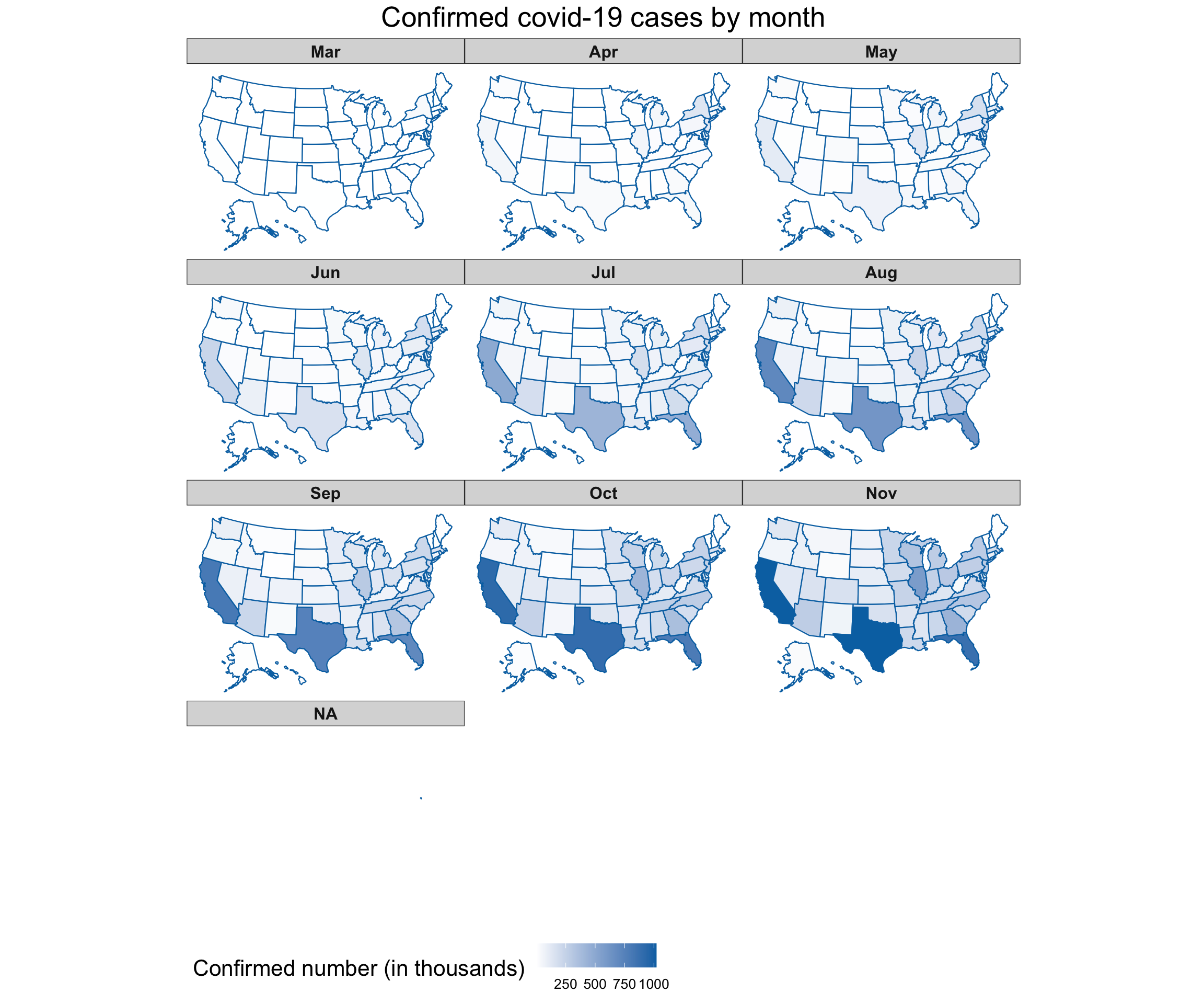
The plots above show the trend of total cases in US from March to November. At the very beginning, we find that the pandemic only exists in NY state (with few cases in other states). As time goes on, the Covid-19 cases spread rapidly through CA, TX and FL from June. From the nine plots above, it seems that the number of total cases in the east coast is higher than the one in the west and middle.
5.1.2 New cases in US
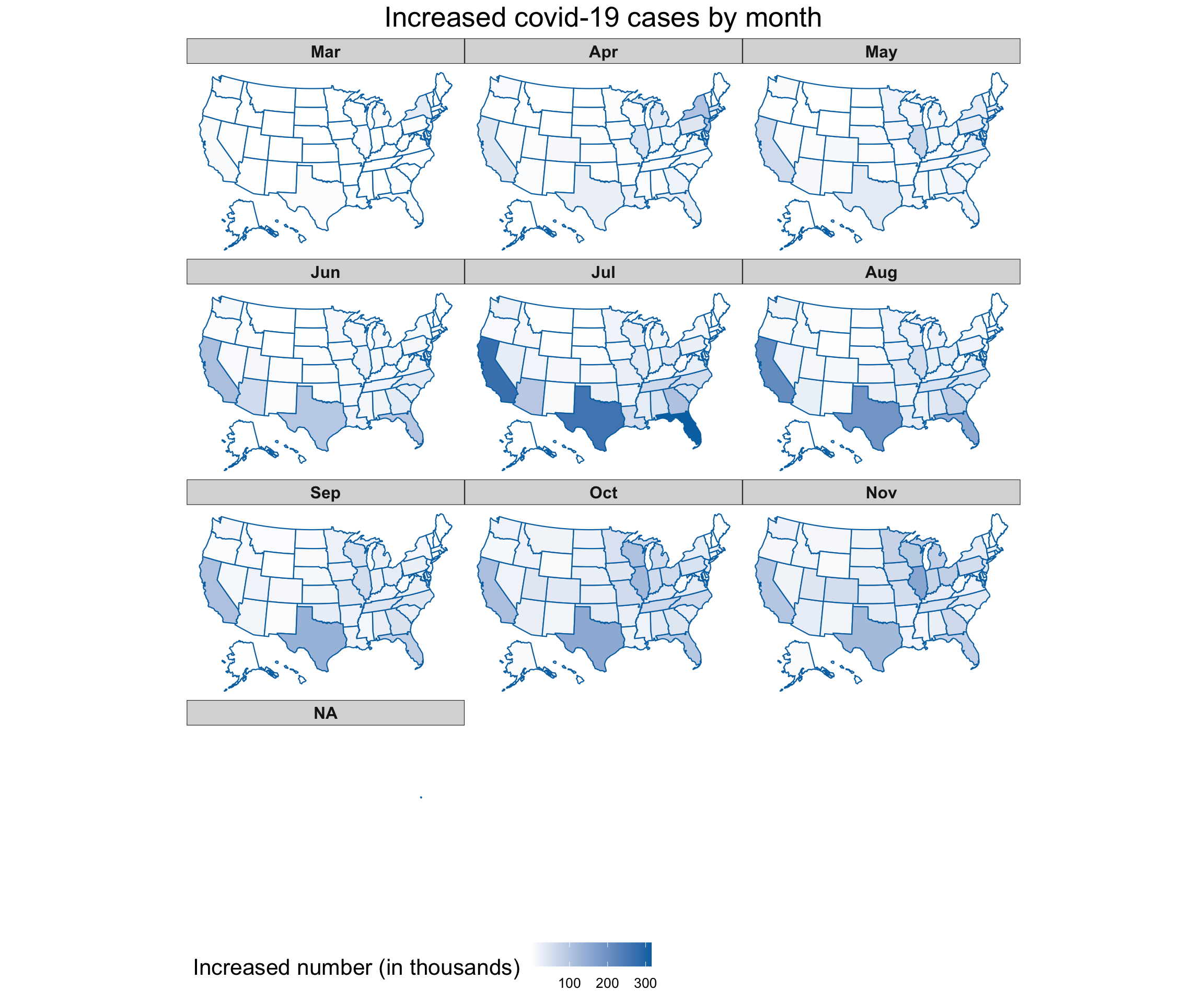
The plots above show the trend of increased cases in US from March to November. In March, the break-out of Covid-19 occurred in NY and surrounding areas. After that, the second phrase of break-out occurred in CA, TX, FL and NY in July. After that, the cases of IL and the nearby regions also increased rapidly.
5.1.3 Monthly new cases (in thousands) by States
This parallel coordinate plot captures monthly total new cases from March to November by States. Observing the outliers of each month, we could conclude that
The situations of NY and NJ were most sever at the beginning of the epidemic, but the new cases were reduced a lot after May.
From June to November, most new cases were confirmed in TX, FL and CA.
The number of monthly new cases in IL has two obvious peaks in May and November respectively.
5.1.4 Ratio of new cases and total cases over time by States
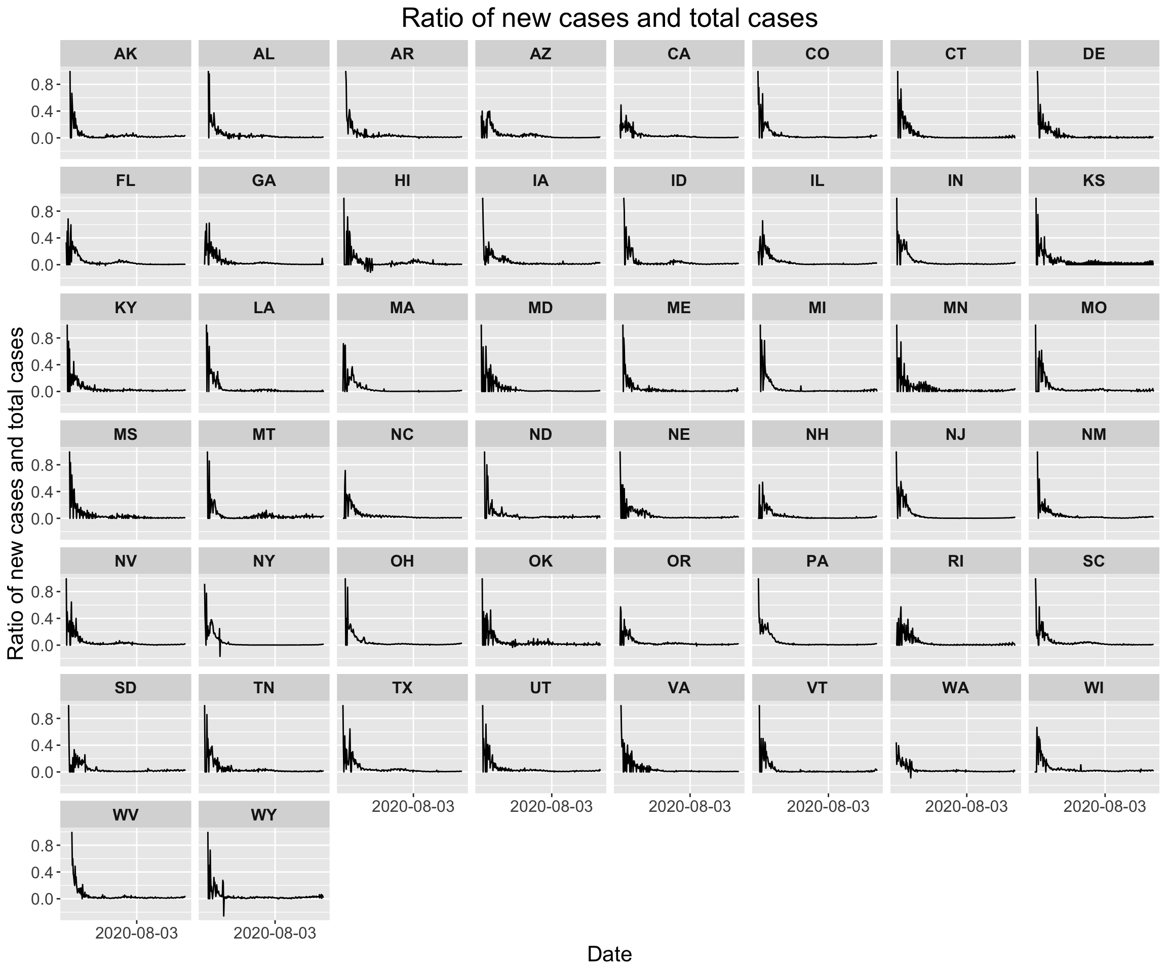
From this graph we can see that the 50 states have a similar pattern in the ratio of New case to Total case over time: very high at the beginning, and then be stable at a low level. It can be a signal that many confirmed patients have been recovered, also shows that Covid-19 control measures have been effective.
5.2 How does medical resources affect Covid19 death rate?
5.2.1 Death rate and Hospital admission rate
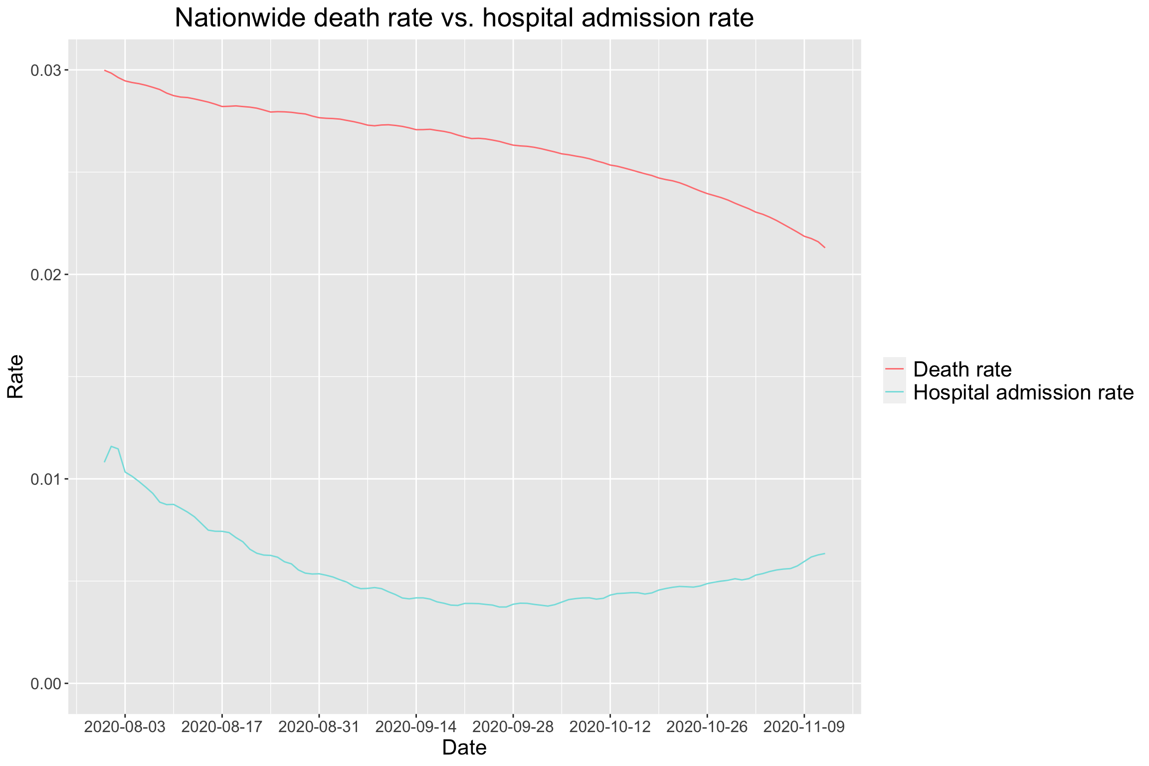
This line chart displays average death rate and hospital admission rate of Covid-19 patients in the US. Because the hospital admission data before 2020-07-26 is missing, time of this plot starts from 2020-07-26. From the plot, we can see that overall hospital admission rate increased from 2020-09-28, and death rate not only decreased but also decreased faster. There are a lot of factors affect death rate, this plot shows that hospital admission rate is one of the factors. And this inspired us to explore the relationship between hospital admission rate and the change rate of death rate.
5.2.2 Decrease rate of death-rate and Hospital admission rate
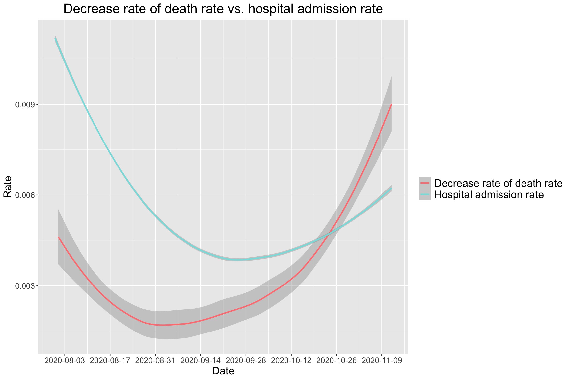
This is a smoothed plot of decrease rate of death rate and hospital admission rate. The pattern is very clear that when hospital admission rate decreases, death rate decreases slower. And when hospital admission rate increases, death rate decreases faster. We can conclude that enlarging the hospital capacity and receiving more Covid-19 patients could speed up the death rate decreasing.
5.2.3 Death rate and Inpatient bed availability
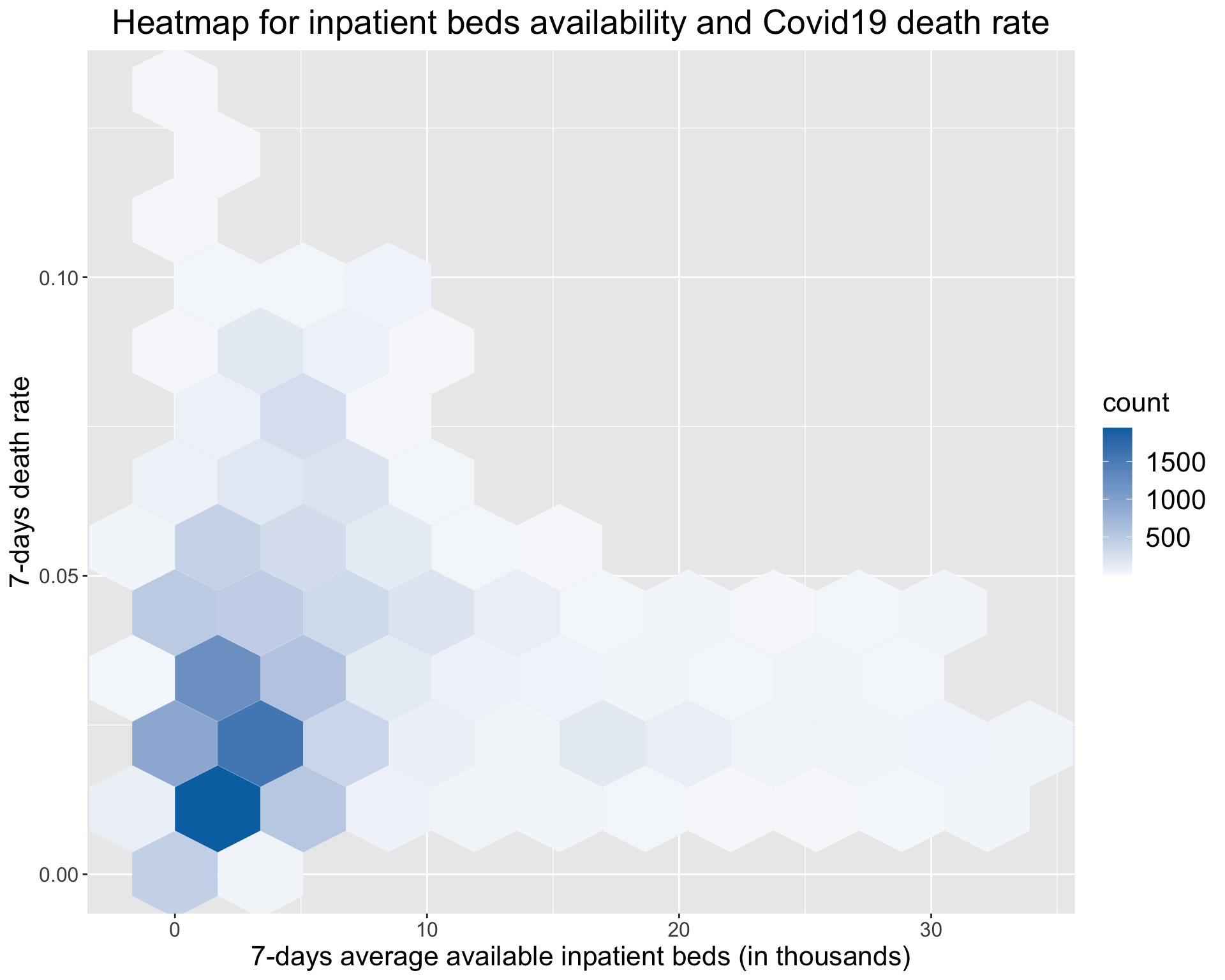
This is a heatmap for available impatient beds and death rate. Because there is a delay for reporting death and death rate is more likely relating to number of available bed before death, we use the 7 days average value to see the relationship. It shows in the heapmap that
Data with death rate higher than 10% has number of available inpatient beds less than 5000.
When there are more than 15000 available inpatient beds, the death rate is below 5%.
5.2.4 Death rate and inpatient beds availability by States
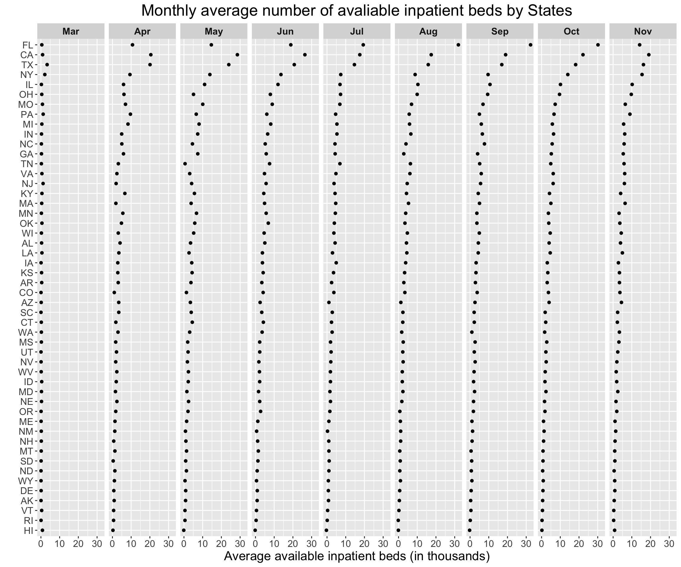
The Cleveland dot plot is about average number of monthly available inpatient beds in different States and facet by month. From this dot plot, we can clearly see that hospitals in most of the states increased inpatient beds from March to November. Compared to other states, FL, CA, TX and NY prepared more beds for Covid-19 patients.
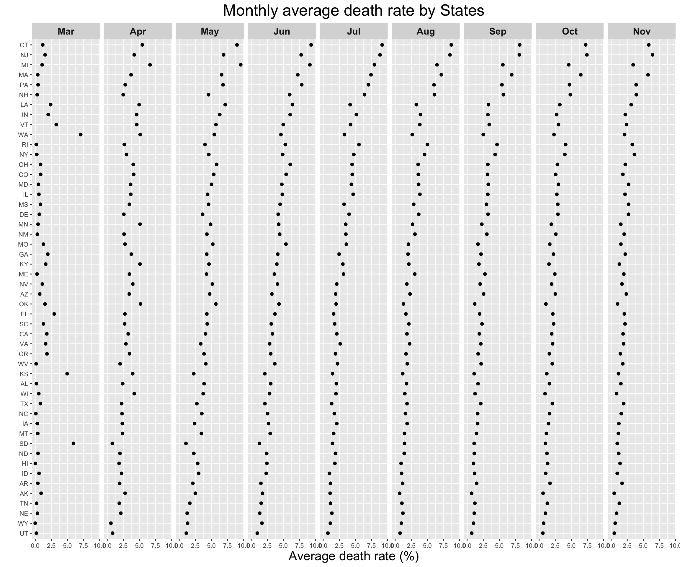
To see the relationship between death rate and inpatient beds availability, we draw this Cleveland dot plot of monthly average death rate in different States facet by months. Together with the inpatient bed availability plot, we found that those states who provide more inpatient beds like FL, CA, TX and NY, have relatively lower death rate.
5.3 Does Covid19 impact differently on adult and pediatric patients?
5.3.1 Comparison between adult and pediatric patients over time
| Month | stat | number |
|---|---|---|
| 04 | total_adult_patients_hospitalized_confirmed_covid | 2 |
| 04 | total_pediatric_patients_hospitalized_confirmed_covid | 0 |
| 05 | total_adult_patients_hospitalized_confirmed_covid | 5 |
| 05 | total_pediatric_patients_hospitalized_confirmed_covid | 0 |
| 06 | total_adult_patients_hospitalized_confirmed_covid | 5 |
| 06 | total_pediatric_patients_hospitalized_confirmed_covid | 0 |
| 07 | total_adult_patients_hospitalized_confirmed_covid | 9779 |
| 07 | total_pediatric_patients_hospitalized_confirmed_covid | 73 |
| 08 | total_adult_patients_hospitalized_confirmed_covid | 8853 |
| 08 | total_pediatric_patients_hospitalized_confirmed_covid | 60 |
| 09 | total_adult_patients_hospitalized_confirmed_covid | 4263 |
| 09 | total_pediatric_patients_hospitalized_confirmed_covid | 44 |
| 10 | total_adult_patients_hospitalized_confirmed_covid | 5759 |
| 10 | total_pediatric_patients_hospitalized_confirmed_covid | 44 |
| 11 | total_adult_patients_hospitalized_confirmed_covid | 7146 |
| 11 | total_pediatric_patients_hospitalized_confirmed_covid | 74 |
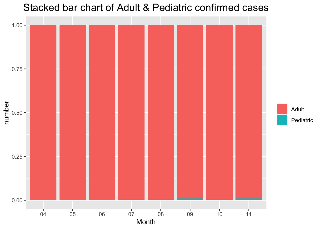
From this picture we can see clearly that from April to September, the percentage of children who and confirmed and hospitalized has different patterns between first three months and last four months. It is because first three most states didn’t distinguish adult and children. In the last four months, we can see that the percentage of children shows an increasing trend. But still, the number of children who infected Covid-19 is much more lower than that of adults. This is consistent with some research result that children are less likely to infect Covid-19 than adults.